移动端的工作已经越来越成为前端工作的重要内容,除了平常的项目开发,HTML 头部标签功能,特别是meta标签显得非常重要。
DOCTYPE
DOCTYPE(Document Type),该声明位于文档中最前面的位置,处于 html 标签之前,此标签告知浏览器文档使用哪种 HTML 或者 XHTML 规范。
使用 HTML5 doctype,不区分大小写。
charset
声明文档使用的字符编码,
html5 之前网页中会这样写:
这两个是等效的,具体可移步阅读: vs ,所以建议使用较短的,易于记忆。
lang属性
更加标准的 lang 属性写法 http://zhi.hu/XyIa
简体中文
繁体中文
很少情况才需要加地区代码,通常是为了强调不同地区汉语使用差异,例如:
为什么 lang="zh-cmn-Hans" 而不是我们通常写的 lang="zh-CN" 呢,请移步阅读: 页头部的声明应该是用 lang=”zh” 还是 lang=”zh-cn”。
优先使用 IE 最新版本和 Chrome
360 使用Google Chrome Frame
360 浏览器就会在读取到这个标签后,立即切换对应的极速核。 另外为了保险起见再加入
这样写可以达到的效果是如果安装了 Google Chrome Frame,则使用 GCF 来渲染页面,如果没有安装 GCF,则使用最高版本的 IE 内核进行渲染。
相关链接:浏览器内核控制 Meta 标签说明文档
百度禁止转码
通过百度手机打开网页时,百度可能会对你的网页进行转码,脱下你的衣服,往你的身上贴狗皮膏药的广告,为此可在 head 内添加
相关链接:SiteApp 转码声明
SEO 优化部分
-
页面标题
</code>标签(head 头部必须)</p> <pre name="code" style="white-space: normal;word-wrap: break-word;border: 1px solid rgb(39, 40, 34);font-family: 'courier new';font-size: 14px;margin-top: 20px;margin-bottom: 20px;outline: 0px;padding: 0px;vertical-align: baseline;line-height: 20px;max-width: 100%;overflow: hidden;color: rgb(102, 102, 102);background-color: rgb(68, 68, 68)"><br/></pre> </li> <ol style="border: 0px;font-family: inherit;font-style: inherit;font-weight: inherit;margin-left: 3em;outline: 0px;padding: 8px;vertical-align: baseline;background-color: rgb(39, 40, 34)" class=" list-paddingleft-2"> <li> <p><span style="border: 0px;font-family: inherit;font-style: inherit;font-weight: inherit;outline: 0px;padding: 0px;vertical-align: baseline;color: rgb(249, 38, 89)"><title></span><span style="border: 0px;font-family: inherit;font-style: inherit;font-weight: inherit;outline: 0px;padding: 0px;vertical-align: baseline;color: rgb(102, 217, 239)">your title</span><span style="border: 0px;font-family: inherit;font-style: inherit;font-weight: inherit;outline: 0px;padding: 0px;vertical-align: baseline;color: rgb(249, 38, 89)"> -
页面关键词 keywords
-
-
页面描述内容 description
-
-
定义网页作者 author
-
-
定义网页搜索引擎索引方式,robotterms 是一组使用英文逗号「,」分割的值,通常有如下几种取值:none,noindex,nofollow,all,index和follow。
-
相关链接:WEB1038 – 标记包含无效的值
为移动设备添加 viewport
viewport 可以让布局在移动浏览器上显示的更好。 通常会写
width=device-width 会导致 iPhone 5 添加到主屏后以 WebApp 全屏模式打开页面时出现黑边(http://bigc.at/ios-webapp-viewport-meta.orz)
content 参数:
-
width viewport 宽度(数值/device-width)
-
height viewport 高度(数值/device-height)
-
initial-scale 初始缩放比例
-
maximum-scale 最大缩放比例
-
minimum-scale 最小缩放比例
-
user-scalable 是否允许用户缩放(yes/no)
-
minimal-ui iOS 7.1 beta 2 中新增属性(注意:iOS8 中已经删除),可以在页面加载时最小化上下状态栏。这是一个布尔值,可以直接这样写:
-
而如果你的网站不是响应式的,请不要使用 initial-scale 或者禁用缩放。
相关链接:非响应式设计的viewport
适配 iPhone 6 和 iPhone 6plus 则需要写:
大部分 4.7~5 寸的安卓设备的 viewport 宽设为 360px,iPhone 6 上却是 375px,大部分 5.5 寸安卓机器(比如说三星 Note)的 viewport 宽为 400,iPhone 6 plus 上是 414px。
ios 设备
添加到主屏后的标题(iOS 6 新增)
是否启用 WebApp 全屏模式
设置状态栏的背景颜色
只有在 “apple-mobile-web-app-capable” content=”yes” 时生效
content 参数:
-
default 默认值。
-
black 状态栏背景是黑色。
-
black-translucent 状态栏背景是黑色半透明。 如果设置为 default 或 black ,网页内容从状态栏底部开始。 如果设置为 black-translucent ,网页内容充满整个屏幕,顶部会被状态栏遮挡。
禁止数字识自动别为电话号码
iOS 图标
rel 参数: apple-touch-icon 图片自动处理成圆角和高光等效果。 apple-touch-icon-precomposed 禁止系统自动添加效果,直接显示设计原图。 iPhone 和 iTouch,默认 57×57 像素,必须有
iPad,72×72 像素,可以没有,但推荐有
Retina iPhone 和 Retina iTouch,114×114 像素,可以没有,但推荐有
Retina iPad,144×144 像素,可以没有,但推荐有
IOS 图标大小在iPhone 6 plus上是180×180,iPhone 6 是120×120。 适配iPhone 6 plus,则需要在中加上这段
iOS 启动画面
官方文档:https://developer.apple.com/library/ios/qa/qa1686/_index.html 参考文章:http://wxd.ctrip.com/blog/2013/09/ios7-hig-24/
iPad 的启动画面是不包括状态栏区域的。
iPad 竖屏 768 x 1004(标准分辨率)
iPad 竖屏 1536×2008(Retina)
iPad 横屏 1024×748(标准分辨率)
iPad 横屏 2048×1496(Retina)
iPhone 和 iPod touch 的启动画面是包含状态栏区域的。
iPhone/iPod Touch 竖屏 320×480 (标准分辨率)
iPhone/iPod Touch 竖屏 640×960 (Retina)
iPhone 5/iPod Touch 5 竖屏 640×1136 (Retina)
添加智能 App 广告条 Smart App Banner(iOS 6+ Safari)
iPhone 6对应的图片大小是750×1294,iPhone 6 Plus 对应的是1242×2148 。
Android
Android Lollipop 中的 Chrome 39 增加 theme-color meta 标签,用来控制选项卡颜色。
http://updates.html5rocks.com/2014/11/Support-for-theme-color-in-Chrome-39-for-Android
Windows 8
Windows 8 磁贴颜色
Windows 8 磁贴图标
rss订阅
favicon icon
比较详细的 favicon 介绍可参考https://github.com/audreyr/favicon-cheat-sheet
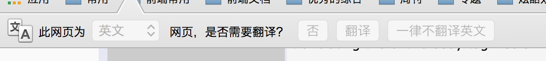
关闭chrome浏览器下翻译插件
有些时候感觉chrome浏览器下翻译插件很烦人,可以通过下面的代码禁用它。
移动端的头部标签和meta
更多的 meta 标签参考
]]>
移动前端不得不了解的html5 head 头标签:等您坐沙发呢!